|
| 2010 Book about Drew Struzan |
Updated
There's a new book about a good portion of Drew Struzan's movie poster career. It's released date is September 24, 2010, and at the time of this writing is being sold at about 30% off at Amazon. It's called
The Art of Drew Struzan.
Use www.ClickFiller.com to find a low-priced item to bring your total to $25 or more for free shipping where available.
Review
I received my copy early, and dived right in. I had 6 or 7 years experience as an illustrator in the movie poster design field myself, and just looking at the images brought back some fond — and some depressing — memories.
The book is full of movie posters — not all of them, though, to my disappointment — a selection from
his career, showing both comps and finishes. Knowing that this was only a selection of a larger body of work, one gets the feeling this guy worked day and night to complete so much excellent work.
The surprise for me was that much of the text purports to be Drew's own words discussing his artwork. Some of the phrasing does not sound like the Drew I have met and feel like I know, though. Nevertheless, it seems to be a telling of a career in an industry that used up, chewed up and spit out one of the last great 'traditional' illustrators of our time. (Traditional in the sense that he created his art with art supplies in combination with his eyes, mind and hands).
From the foreword by Frank Darabont (Director,
The Shawshank Redemption, The Green Mile, The Mist) to the end of the book, the message is about the glory of the process of creating great art, and a lament that it is ultimately about money for the corporations that dish out movies, committees of people who believe they are actually important, making decisions in areas of visual appeal for which they can never hope to be qualified. Far from being a sour grapes tell-all (names are withheld to protect the tasteless, but a few punches are thrown nonetheless), Struzan speaks of gratitude for what his career afforded him, yet between the lines you read how easily for him came the decision to retire.
That language is raw and unvarnished at times from all contributors to the book, PG-13, as it were. It was, after all, a career in Hollywood.
For the visual artist, painter, or illustrator, the book is a virtual treasure chest of examples of how to design within (and without) a rectangle; how a work flows, how to control the viewer's eyes, and how to successfully tie elements of a montage together. Today's digital 'artists' with Photoshop and a Wacom tablet would do well to study this book for the use of color, transition, design and texture, use of lighting for drama and staging, and the absolute need for compelling imagery Drew's images demonstrate. A few years spent learning in a solid art school that teaches those things wouldn't hurt, either... if one can be found anymore.
There are three illustrators that influenced me more than any one else in my career, besides Norman Rockwell and JC Leyendecker of the past, and I was fortunate to get to be friends with each of them, often competing for work.
Steven Chorney, who did nearly every piece of art inside the TV guide for years, Drew Struzan, (he pronounces it "STROO-zn") who was also a friend of Steve's and who was to movie posters what Norman Rockwell and Leyendecker were to magazine covers and advertising art, and
Morgan Weistling, a 19-year-old kid who at the time had a growing reputation along the lines of "he's even better than Drew Struzan!" As much as I admire my friend Morgan's work, and am grateful for his substantial influence on my understanding of painting,
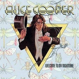
Drew is a legend, too! From the first piece of his I ever saw and liked immediately— an
Alice Cooper album cover from my high school graduation year, 1975 — to, well, everything he's done. I would learn later that Drew was 28 years old when he did that piece of art.
 |
| Alice Cooper Album Cover - Struzan |
The album cover for Alice Cooper's
Welcome To My Nightmare —not my cup of tea, but I ran into the album at a friend's house — was something I recognized as a beautiful design and decorative figure reminiscent of JC Leyendecker's paintings, whose work along with Norman Rockwell's I was just getting acquainted with at the time.
In 1987, I was attending a "Portfolio Review" sponsored by the Society of Illustrators. Drew was to be one of the reviewers, and I had wanted to meet him for about 10 years. I'd heard stories about what a remarkable student he was when he attended Art Center, years before I did.
Since I had been making a living as an artist for the previous 7 years at that time, I did not present my portfolio for review, since it was more for students or beginning illustrators. The evening was winding down and Drew's review station was empty so I went and introduced myself. After awkwardly telling him what a pleasure it was to meet him, and "I'm your biggest fan" and all that, he said "Well, show me what you've got..." gesturing to my portfolio that I had in my hand.
"Oh, no... I wasn't here for reviews, I just... uh... I don't really want you to see my..."
"Come on. We're in the same business. let's see it," he insisted with a smile.
I won't bore you with the details, but he was very complimentary — and then said, "Your work lacks love."
"Love?"
"Yes. It doesn't look like you love doing this for a living."
"Well, really, I don't. It's
tedious, hard work, and I do too many
all-nighters. I have a growing family to feed and I am always tired."
He asked me how much I made in my best year, and so I told him that this was my best year so far, and I was on track to make
xx dollars." His eyes widened, and I thought he was going to scold me for complaining when I was making plenty in a tough field. Instead he said, "I make that much in a month. No wonder you don't like your work."
 |
| JFK by Darrow |
He asked me to show him just one piece I loved, and so I showed him my illustration of John F. Kennedy,
right, that I had done for the 1983 20th anniversary of the assassination, to be used for a local San Diego TV-guide-like magazine called Tuned-in.
That was a bit embarrassing, since it was a direct knock off of the style of another favorite of mine, Richard Amsel, who'd done a slew of TV Guide covers, many of which I had collected and hung on my wall in my studio.
 |
| John Travolta by Amsel |
In fact, Richard had done the first Indiana Jones and the Temple of Doom poster, the series of which Drew Struzan dominated after Richard's death in Nov. 1985 from a relatively new disease at the time, AIDS. Amsel's final work was a cover for TV Guide with portraits of Dan Rather, Peter Jennings and Tom Brokaw. Amsel died three weeks after its completion.
Drew asked me why I loved that one. I just shrugged and told him that it was because I got it done quickly. It only took a few hours. (I never told him I only got $100 for it). He said, quite matter-of-factly, "Well, that's no small thing. Maybe you're not cut out for all the detailed and tedious work. I could never do what you do [referring to the rest of my portfolio's tedious stuff]."
It had never dawned on me to choose to do work that fit my personality. I had thought it was a virtue to be thankful for work at all, and just do it.
Without missing a beat, Drew invited me to his home and studio in Lake Arrowhead, and for that day, about 3 weeks later, Drew took me under his wing, showing me dozens of originals and even a slide show he'd put together for public meetings showing his methods, start to finish. I was in Illustrator Heaven.
 |
| David R. Darrow & Drew Struzan 2009 |
Drew's generosity and directness breathed hope into a 30-year-old illustrator that year. I will forever be grateful.
22 years later, I ran into
Drew and his wife Dylan at the Pasadena Museum of California Art, and was delighted that he remembered my name. He had a few very nice pieces in the gallery show, including a figurative sculpture and several oil paintings.
It was great to see him and if you'll excuse me, I must go buy his new book,
The Art of Drew Struzan.

 by David R. Darrow